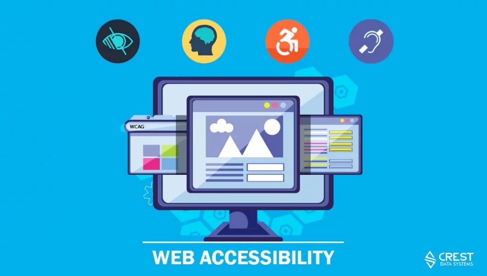
Web Accessibility: How to Enable Access for Everyone

Accessibility is seldom discussed in today’s web development and design.
The web is fundamentally designed to work for all people, regardless of their hardware, software, language, location or ability, enabling the access to people with a diverse range of hearing, movement, sight, and cognitive ability. Despite this, many engineers/developers fail to develop and maintain their project without having considered aspects of web accessibility before.
The importance of web accessibility
Tips and tricks to an accessible website
Ways to audit web accessibility
Resources for further learning
Introduction
Web accessibility (a11y) is a practice where websites, tools, and technologies are designed and developed in a way that people with disabilities can use them.
Importance of web accessibility
Have you ever read a book without a table of contents, indentations or proper usage of headings to differentiate the order of hierarchy? It would feel like reading a wall of text without knowing when the paragraph will end. Without an accessible web page, a person with a visual disability feels the same way when using a screen-reader like NVDA, JAWS. These screen readers follow Web Content Accessibility Guidelines (WCAG) with guidelines for developers to ensure web contents are accessible under four principles:
1. Perceivable
Information and user interface components must be presentable to users in ways they can perceive.
But how?
Provide text alternatives for any non-text content so that it can be changed into other forms people need, such as large print, braille, speech, symbols or simpler language.
Imagine your image is not loaded but the text alternatives can explain what the missing image is for the visually impaired person through the screen reader.
2. Operable
Where user interface components and navigation must be operable.
But how?
Make all functionality available from a keyboard to navigate your page.
Try pressing Tab key to navigate through the page elements without jumping all over the entire page. The correct flow of navigating should be from top-left to bottom-right and menu to menu.
3. Understandable
Information and the operation of user interface must be understandable.
But how?
Make text content readable and understandable by identifying and explaining any unusual words or phrases with a definition.
If someone responded to you with “CID”, would you know what it means? It could be “Consider it done”, “Crying in disgrace” or any wild word you can think of.
4. Robust
Content must be robust enough that it can be interpreted by a wide variety of user agents, including assistive technologies like NVDA, JAWS, or ChromeVox.
But how?
Maximize compatibility with current and future user agents, including assistive technologies.
A quality web page should be parsable with the corresponding start and end tags, unique IDs, well-organized usage of the name, role and value to determine the current state for the assistive technologies to function as intended.
Note: Did you notice I structured and listed my paragraphs with numbers and bullet-points? If I removed all this formatting, you might still be able to read but it’s much harder to read.
Fun Facts
An employee from Digital Equipment Corporation (DEC) was referred to as “S12n” because his last name, “Scherpenhuizen” was too long to be an account name. The use of such numeronyms became part of DEC corporate culture and followed by “i18n” for “Internationalization” and “k8s” for “Kubernetes”.
Accessibility is denoted as “a11y” because there are 11 letters between the “A” and “Y” in the word “Accessibility”, a pattern known as a Numeronym.
Tips and Tricks
Your inner voice is screaming, “Okay, Okay. I know accessibility is important, but how do I start implementing these techniques?”. We would discuss that in our next section “Tips and Tricks”, which is about making your web page into an accessibility rock star.
1. Make Sure Your Site Is Keyboard-Friendly
I repeat, make sure we can use your site with the keyboard entirely. This step is the most important to make a website accessible because many assistive technologies rely on keyboard-only navigation.
The most common method of navigation using the Tab key to jump between areas on a page with ‘keyboard focus’. These elements include links, buttons, and forms.
2. Make Sure All Content Is Easily Accessible
You can do this by using ARIA landmarks tags that allow you to add content in order as appear on the page. One of the easiest ARIA features to implement that provides significant immediate benefits to screen reader users, is landmark roles. To use them, simply add a relevant role attribute to an appropriate container within your HTML allowing screen reader users to quickly jump to that section of the page. Some widely used ARIA landmark roles are:
role=”banner”
role=”navigation”
role=”main”
role=”form”
role=”search”
If a role is used more than once on a page, consider aria-label attribute in order to distinguish between two regions. For example,
<div role=”navigation” aria-label=”Main menu”>
<div role=”navigation” aria-label=”User menu”>
3. Choose Your Colors Carefully And Wisely
Be careful when you are adding a wide array of colors to make your web pages visually appealing because some peoples may perceive colors in unique ways. There are plenty of online tools you can use to find and test color combinations. WebAIM has one option. We also like Contrast Checker because it gives you a score in real-time. Do not use color alone to convey information. For example, use an asterisk in addition to red color to indicate required form fields, and use labels to distinguish areas on graphs. WARNING: You also want to avoid clashing colors that could cause eye-strain like this one.
Fun Facts:
Red and Pink are Different Colors; FALSE
In WCAG, when we say color, we refer to hue. Red and pink are the same hue with different lightness.
This is important because coding things in dark red and light green would be differentiable, even to someone with color blindness, in the same way dark red and light pink can be differentiated even when presented in black and white.
Audit a Page’s Accessibility
After having a comprehensive understanding of accessibility, you might want to check if a page is accessible by running audit tools. There are many accessibility audit tools like Dynomapper, A11Y Compliance Platform, and PayPal’s AATT (Automated Accessibility Testing Tool). One of my favorite and fastest tools is Chrome DevTools Audits.
The process is as simple as going to the URL you want to audit and click Audits tab within the DevTools after pressing CMD + Option + J (Mac) or Ctrl + Shift + J (Windows). Click HERE to read more.
Conclusion
All WCAG Success Criteria are written as testable criteria for objectively determining if content satisfies them. Testing the Success Criteria would involve a combination of automated testing and human evaluation. The content should be tested by those who understand how people with different types of disabilities use the Web. As a developer, we should try our best to enable our web content to be easily accessible by a wide range of people.
Resources
For more information on WCGA Techniques, you can check the links below.
Google Developers Accessibility Fundamentals
Mozilla Developer Network’s MDN Understanding the Web Content Accessibility Guidelines
Also Read: Web Accessibility: Designing an Accessible Color Palette
Author
SEIN TUN
Sein Tun is a Software Engineer working at Crest Data. He has varied software development experience utilizing modern technologies and frameworks like React, Redux, Node.js, JavaScript, Python, and Golang to build secure high-performance systems. Before joining Crest, Sein worked as Financial Banker and Assistant Manager for 3 years with JPMorgan Chase Bank excelling in customer experience, compliance, and team management. He is a proud alumnus of the University of California Riverside with a Bachelor of Science in Management Information System. He enjoys building applications that improve and make a difference in people’s lifestyles.


